now safely past the ire of iceland's volcano, and finally over a hideously lingering business class virus, i'm hankering to post some reflections on what i learned about art during my eleven weeks in venice, zurich, berlin, amsterdam and london.
i saw a tremendous lot of paintings, tapestries and sculptures, across a wide variety of institutional settings, with and without adequate curatorial attention and light engineering, in person and in catalog reproductions, at first impression and revisited, weary and fed, sketching or sauntering, sober and stoned. and the core of my experience is the profound, complex and disorienting perception of what it is to really look at art
in situ, as opposed to merely recognizing and responding to a reduced and gamut limited image reproduced in a print or digital format.
i'll begin with the painting by charles guérin called out previously -- actually the digital image of the painting as it appears on the
hermitage amsterdam web site.

now the first question you probably
do not ask yourself is --
how big is this painting? my first insight was how far we're habituated by modern image reproduction media to disregard issues of scale in the encounter with an image.
i've posted on my web site a
long examination of the relationship between a picture format and the pictorial impact the format asserts on the viewer -- both as an implied viewing distance in a public space and as a virtual claim about the relative physical scale between the objects in the image and the viewer -- which i call the display geometry. issues of display geometry were impressed on me repeatedly as i went through the dozens of museums along my itinerary.
to answer the question: the guérin painting is ... large. i can't find reliable documentation (and the museum catalog is infuriatingly unavailable from amazon.com) but my recall is that it is about 5 feet high by 4 feet wide. as the model's head would go out of the frame if she stood up where her left foot rests, this is clearly a "life size" or
reproduction representation, which puts our encounter with the model on a human, literal and earthbound footing.
now dwell on that human and earthbound model. the perfectly understated sag in her upper arm, buttock and hip, the yield of her thigh against the edge of the chair, the intimations of coming middle age in her breasts and stomach ... i even see a little of lucian freud's trademark
sitter boredom in her expression ... everything combines to convey a rembrandtlike quality of realism and vulnerability. (to better appreciate the pose, compare it first to
my favorite rembrandt on the one hand, and then to something by the tediously vapid
charles bouguereau or the snide
gustave courbet on the other.) the large format projects that vulnerability as a living human presence, a life rather than a figure, but a life that is quite obscured by the digital image.
the hermitage "expert" commentary on this painting is quite amusing:
As a student of Gustave Moreau, Guérin learned to exploit the decorative effects of colour without obvious experimentation. He honed his skills by copying old masters in the Louvre. In his work he remained true to identifiable form and his palette was harmonious rather than bold, despite fauve influences. Shchukin was particularly enthusiastic about Guérin, who represented his models in attractive poses. This model poses serenely, apparently untroubled by the large, fashionable hat which forms a provocative contrast with her nude body.
Sergei Shchukin was a wealthy russian businessman turned art collector with an uncannily clear and unfaddish eye for art excellence -- many of his personal selections were in the amsterdam show -- so we have to ask what he found so precious in this work. my answer is ... its intoxicating color harmony and affirming light.
this is almost entirely lost in the digital image, because of what is called
gamut mapping -- the compromises in lightness contrast, hue accuracy and chroma range created by forcing a fully dimensional pigment landscape into a trichromatic (RGB or CYMK) color reproduction medium with a limited dynamic range.
the color keystone to the guérin painting is located, of all places, in the gilt frame behind the model's hat. this highly reflective surface signals to the viewer's eye both the intensity of the light falling on the painting and its color as well -- gilt goes steely under green light, or copperish under warm light. here the frame appears glinting with creamy warmth in the original (an effect lost in the digital image), and the eye, taking that as the anchor for white, spreads that effulgence throughout the canvas. under this warm light, her figure is expertly (subtly!) and realistically contrasted -- the legs sculpted with pale, soft touches of red and magenta in the original (they're just brownish in the image), her torso an iridescent analysis of green gold and warm tints in the original (drab yellow in the image). this contrast is handled so delicately that at first you don't notice it. and the color balance is assisted by the wall behind, which is not a scumbled gray but a mist of rose, teal, green and azure worthy of tiepolo; this intensifies into a shadow outline around the figure that is a dark blue green brightening almost to pure teal, which summarizes the chromatic bias of the "gray" wall, forces the green golds toward yellow, and draws more pink out of the magenta. it's a vision that shimmers. there's not much shimmer in the digital image.
we notice the green hat and orange seat cover. the studiously stupid "color theorist" might remark that this is the classic tension between red and green, introducing a fauvist dynamic conflict into the image ... van gogh would understand, oh yes! in fact its role is quite different, and the correct answer is clear in the presence of the painting. (again, the digital image fails us.)
the orange/red mixture is highly saturated (it appears very close to a pure cadmium scarlet red, which was newly available by 1910 when this painting was made). even more saturated is the ultramarine blue of the hat -- ultramarine being the most saturated single pigment of any hue available to a painter. and the green (probably viridian) has been mixed and lightened with yellow to boost its chroma as well. but the point of these colors -- these pigment selections -- is
hue purity. the eye cannot see maximal hue purity unless the light is both chromatically "broadband" and also sufficiently luminous to perk up the eye to its full chromatic response. (a reddish light would dull the green, a yellowish light would dull the blue, a greenish light would dull the red.) each color prevents the other from tipping the chromatic balance of the image, but all contribute to the sense of powerful, clear, creamy white light emerging from the canvas.
i had several encounters with the art holocaust of gamut mapping during my vagabonding. the most scrupulous was the rainy afternoon i bought an exhibition catalog at the
ca' pesaro gallery (an exhibition that really rocked my art understanding ... more on that later), then spent hours going through its modern art exhibition work by work, comparing the painting to the printed image. over and over, not only was the printed image wildly, almost painfully inadequate, but specifically the effect or charm that i felt was the essence of the image was trampled on, distorted, or obliterated. grays were hugely wrong; warms were cools and crispenings were soggy. blacks went from depth to dirt. flesh tones were cheapened and thickened. chiaroscuro turned into quilting. (as if to cement the insight, the binding of the catalog fell apart, and the cover separated from the pages.)
a more familiar example is this famous vermeer painting, which i encountered in the amsterdam rijksmuseum:

especially in printed images, that girl's apron is a muted dark middle blue, often matching a prussian blue (or a phthalo blue GS, since printed images mean CYM mixtures). the shock was -- that apron is pure ultramarine! it has an almost electric brilliance. it's nowhere purple (as it seems in the digital image), and it glows all the way into the deepest shadows, which in the image appear black. (the effect is so potent that i had reservations about the restorations that might have been inflicted on it.) but the point is, whether it's a restorer's blunder or the artist's intent, the image seriously distorts what the actual painting looks like. again, looking at the painting, the visual interpretation of the light is made more emphatic by the chromatic brilliance, a keynote that is amplified by the sparkling texture of the objects on the table and the brimming stream of pure white milk.
speaking of light, the third important insight i developed, across many museums using many different lighting strategies, is the light contrast put on the works. the standard gallery practice is to vignette the painting in a cone of light, as viewed inside a relatively dim room -- look at the gallery photos of the hermitage amsterdam exhibition at the bottom of
this page, where the camera clearly brings out the lighting contrast. in that lighting arrangement, the eye adapts to the dim ambient light rather than the localized spot lights (which are partly dimmed for the eye by the dark and dull colors of the painting), so that a painting is pushed upwards in apparent brightness, and in the extreme can be made to appear almost to glow like a backlit transparency. this increases both the lightness and chroma contrasts and, though the light contrast was more subdued in the guérin work viewed overall, the effect was magical. the woman appears to be embodied in light.
my fourth and last learning takes me back to that critic's commentary quoted above. i can't read something like that without a weary feeling that many critics have been educated for too long (and perhaps write too many commentaries based on digital images). the subtext seems to be the hackneyed
modernity myth: art is about "movements" and movements are inherently about -- well, you know, innovating, shocking, pushing limits, épatezing those bourgeoisie types and burning down the salon. poor plodding guérin, the "conventional" colorist, the provincial art professor who stuck to his prejudices! we'll let shchukin have a pass on this one ... with the fatuous innuendo that it must have been guérin's "attractive poses" and "provocative contrasts" that caught shchukin's taste for lubricious wall candy.
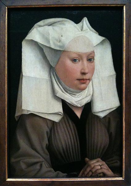
my reply starts with a painting by rogier van der weyden in the berlin gemäldegallerie, something usually given (with modern agnosticism) the title "portrait of a young woman".

this is an iphone photo of the painting -- the germans encourage photography, and the iphone does a surprisingly fine job of catching the color balance correctly. but color is not why i kept coming back to this intimate portrait, just 19 inches high. in that format the head is a bit over 6 inches high, or smaller than life size, which has the magnetic (and for most viewers, probably unnoticed) effect of drawing the viewer closer to the painting -- much like the attraction exerted by any handsome person. and at close distance what springs into view is the incredibly fresh, tender and exquisite mouth, which is curved in an implicit emotion and latent speech, dimpled with character and moist with breath. the harmony created by the contrast with those alert, penetrating and calm eyes is extraordinary.
it's clear from the overall that, despite the care lavished on every part -- the precise fabric textures of linen and wool, the beautifully judged value contrasts between background, skin and starch, the delicately managed emphasis of light on the face rather than the hands, the gorgeously modeled flesh tones -- it's the mouth that was the focus of patient effort for the painter; even the eyes look hasty in comparison. and the fascination of that mouth lies in a sensuality that the pleats curving over the woman's breasts only complements. it's a gratitude that can redeem every evil that life can put in your path.
i'd accept the conclusion that this is the artist's wife, or certainly his beloved, rather than a random commission or studio product. something was done here that, despite the very different means, is exactly the same as the light and life i saw in the guérin nude, and in many wonderful paintings besides -- most of them hardly famous. it was this something, call it joy or love or reverence or gratitude, that i learned to look for and feel pleasure to find in art.
it seems to me that one of the miracles of art is that this reverent illusion can be created in so many ways, as images of so many different events and objects painted with so many different styles and techniques. in the same way, we can feel whole, fulfilled, and spiritually thankful in all kinds of encounters -- a kind word, a warm meal, a passing storm, morning light, a silent night, a child's eyes, a flood of music, a well placed soccer goal or a buzzer beating three point shot in basketball.
the fact that this pleasure and this sensuality has nothing to do with art movements and "art theory" is perhaps why it is missed in contemporary overintellectualized art criticism. there is no breakthrough, no revolution, no stylization here! just an intimate honesty that must have cost the painter a labor at his limits.
modern art criticism, the blather about movements, innovations and greatness, the pathetic nursery tale of breakthroughs and bigness, obscures the quotidien craftsmanship in art. art is work, and work is something you do every day for years. it also implies a uniformity of response to art that is completely out of whack with the supposed individuality of our identities, our perceptual quirks, our idiosyncratic readings, educations and life experiences. one of the greatest pleasures in art is to visit a museum with someone you love or treasure, especially a maturing child or dear friend, and share with them your individual enthusiasms.
what we inherit as a result of the modernity myth is an art that is deeply demoralizing in its capacity to trivialize and posture, to automate our esthetic response to manufactured stimuli and to level all excellence into mere stylistic plurality. murikami's "cowboy", a larger than life, industrial acrylic sculpture of a naked manchild making a lasso of his copious and treacly ejaculation, is for me the epitome. of course i get the irony and polish and manga exuberance and twitting of the sexually straightlaced. but it is still the kind of thing that, when i came upon it in the customs house museum in venice, anchored my eye with incredulity and contempt. if the weyden portrait is a star, then this is a black hole.

the point for an artist like murikami is the dollar revenue imperative, invitations to the right parties and clubs, lionizing media attention and a workshop production machine. it's the same art economy that the mass media reproduction of paintings, as postcards and art books and digital images, encourages and amplifies. it's the art economy that socializes us to think of paintings as intellectual tokens in a historical narrative in which the touchstones of merit are marketability and critical notice, and then habituates us to accept the image as the original -- a format detached image, a gamut stripped, luminance crushed and critically filtered image, now become an "idea", a "concept", an "icon", a "landmark". (would you like an audioguide with that concept?)
there is something lost that only the painting can preserve and reveal to us. yes, guérin was a minor painter with an income he had to supplement with advertising art. yes, van der weyden was a master painter who did something out of the way, off the narrative, with his singular little portrait. but the same light shines through both works. it's the light of patient craft, hard won skill, unrelenting labor, and the exchange of career pretense and the acclaim of posterity for a work that does justice to life.


